

Emulating Film P3: Color Treatment
This article assumes you’ve at least skimmed through my previous two articles on the development of my film emulation pipeline, but if you haven’t and simply wish to get into the nitty-gritty here, I won’t stop you. For anyone looking for the previous articles here are P1 and P2.
Now, on to the good stuff.
In the previous article I discussed how I’m developing a film emulation pipeline to work consistently across a wide variety of lighting conditions, so that tweaking would be minimal. The idea with this, much like in editing, is to spend the bulk of your time setting up and organizing, so that hard work is done for you once you get into the actual cutting.
I was happy with the uniformity of the emulation, but there was clearly some work to be done, mainly in color and the treatment of colors across all those situations.
One of my weaknesses in color grading is the actual color work, and the tools available for it. The X vs X curves or grids or whatever are usually too scary to really delve into, or just don’t make sense intuitively. But in order for this pipeline to really work, I want a consistent color treatment. There needs to be a consistent red, consistent green, and consistent blue. On top of that can go the stylization.
Lum VS Sat Curves
Until recently, I had never messed with any of the “VS” curves, finding them confusing and intimidating. Turns out they are neither, though learning about it online can be. The Lum VS Sat curves simply effect the saturation of a color, across the range of the image from the brightest to darkest parts.
It’s a hugely creative tool, but here will be used for one simple objective: making sure highlights are white, and shadows are be black, without color pollution.
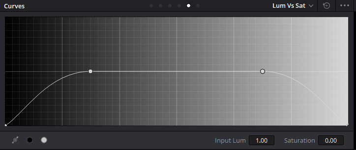
The curve looks like this.
It sounds obvious, or maybe it doesn’t, but the way most film stocks react to light is that the more light there is, the closer to pure white the image becomes. The same in reverse is true (usually); the less light the film stock receives, the more black the image is. The caveat being either light pollution during development, or a cheap film stock giving a color cast across poorly exposed areas.
In this emulation I’m operating under the idea of a high quality film stock, one which does not cast any colors in the shadows or highlights.
Color Treatment Step 1: In-Camera Tweaks
When working with an 8-bit codec (even in an enhanced container, like ProRes) your biggest challenge is going to be capturing color, keeping that color consistent, and keeping it pleasing.
There isn’t a lot of room in post to play with the color, when compared to something like an Alexa.
Inside my A7S, I have a custom Cine4, and SLog2 preset. I rarely use SLog2, since it’s much less intuitive, but should I decide to I’ve made it so the color (with minimal tweaking) can blend with the Cine4 footage. It’s not an exact match, but it works well enough.
In other low-end cameras, like a T3i or GH3, the solution would be much the same: fine-tune the color inside the camera.
For something like the T3i you’re very much locked into a look, with simple saturation sliders. I haven’t used a GH3, so I can’t say what the process might be for that type of camera, but the theory behind it would be to find a way to maximize color clarity in-camera, so that in post you’ve got room to enhance, rather than completely changing a color.
This process can be time consuming, and frustrating. To save time, you can try this pack from EOSHD, specifically for Sony cameras. This is not a sponsored link, nor have I used the product, but the results online look great and for $15 it can save a lot of manual tweaking time.
REMEMBER: Higher ISO values, ND filters, and any number of factors can change the look of your image.
All the color tweaking in the world won’t save your shadows from noise if you’re shooting at 256,000ISO.
Color Treatment Step 2: Consistent Colors
Once the in-camera color is solved, treating it consistently across the emulation becomes key. This would apply regardless of the grade, but lets say for example you’re creating a moody, desaturated look, but want the pops of green and skin tones, like in an Aidin Robbins video: you’d want to be sure that the computer understands the difference between red, reddish, and not-red-at-all.
This would fall very much under the “color correction” part of the process.
By bringing your disparate clips into the timeline, you can compare directly what your images look like. Ideally, they’d match closely, but if not this would be the part where you bring those colors into line.
For tips on color correction and grading, as well as in-depth tutorials, watch anything by Avery Peck.
Color Treatment Step 3: Grading
This is the part where there are a lot of rules, and none of them matter. While I personally don’t like green skies and blue shadows, if that’s what you’re going for then go wild.
For this part I gather reference images from a variety of sources: photography, movies, music videos, etc.
Here’s a selection of reference images for Ava, credits linked.
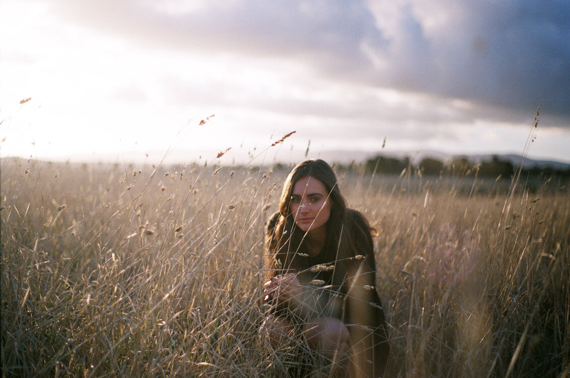
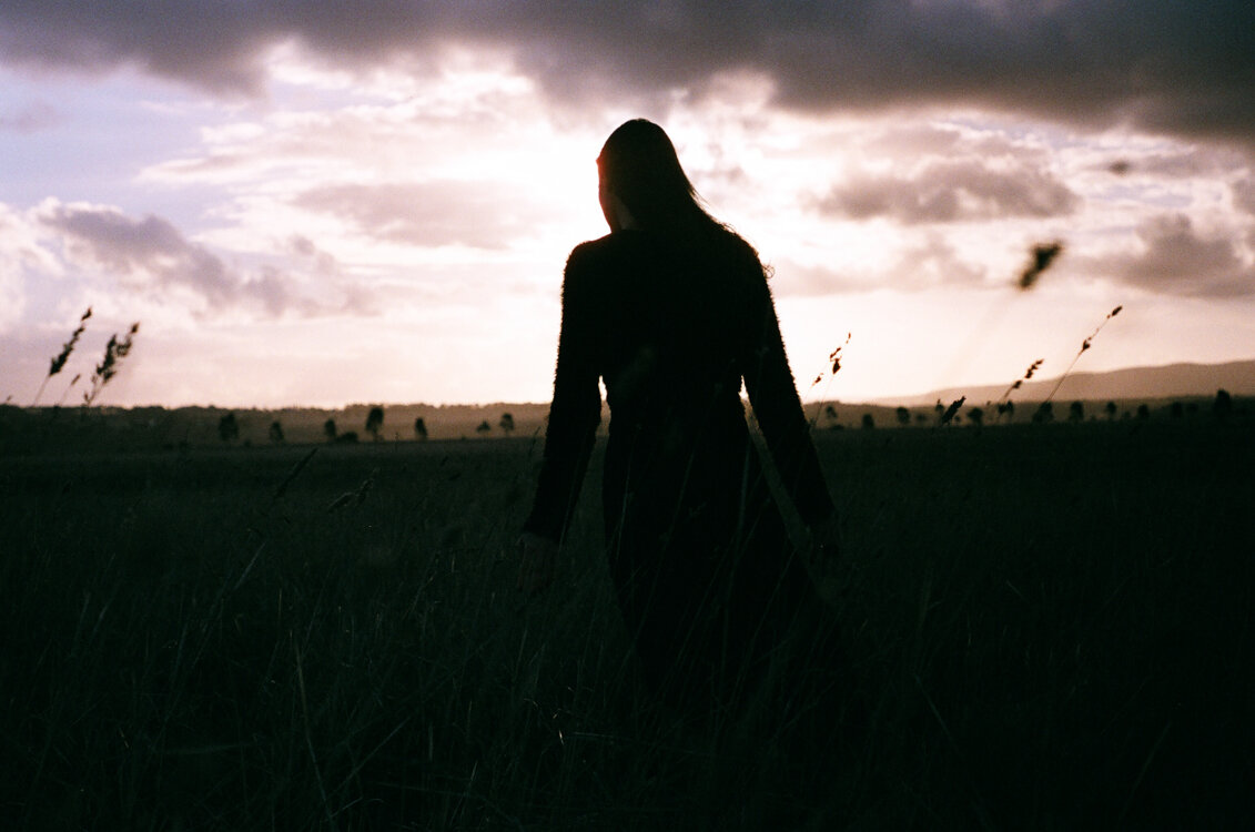
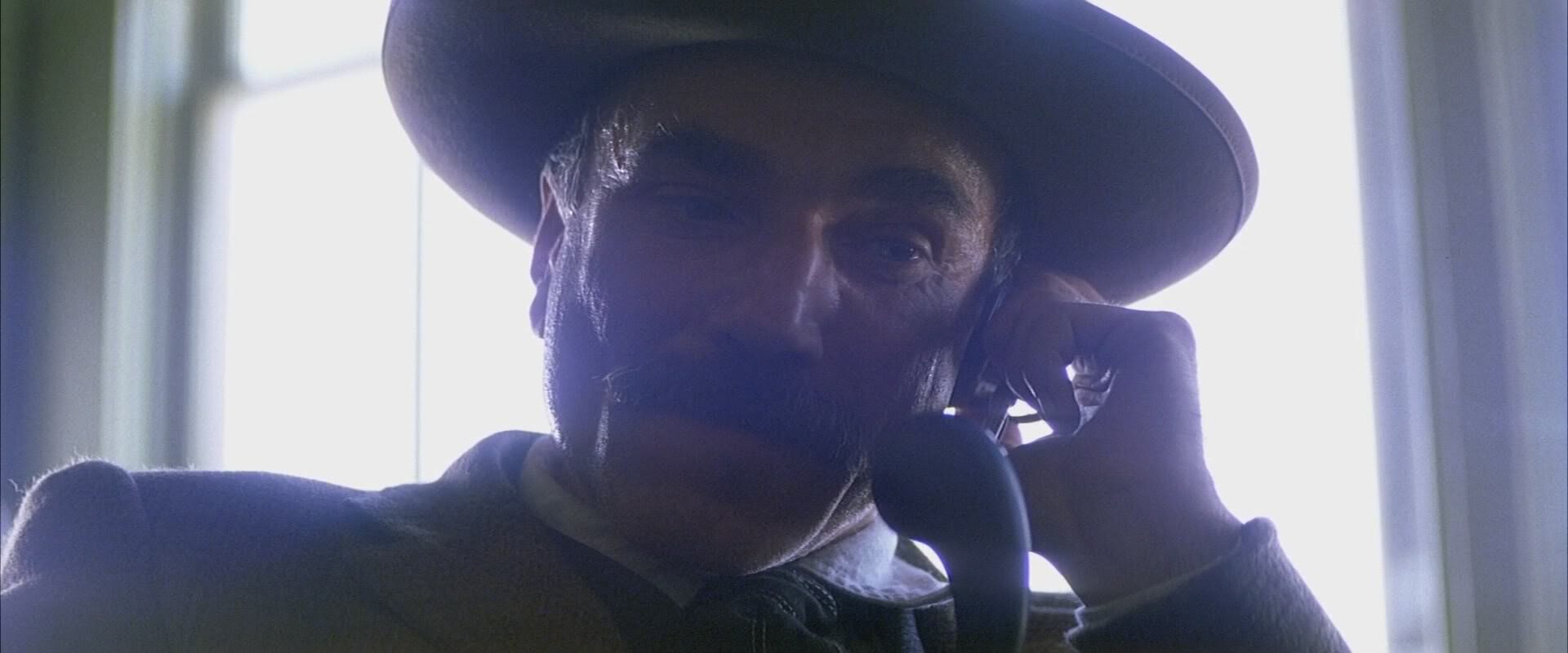
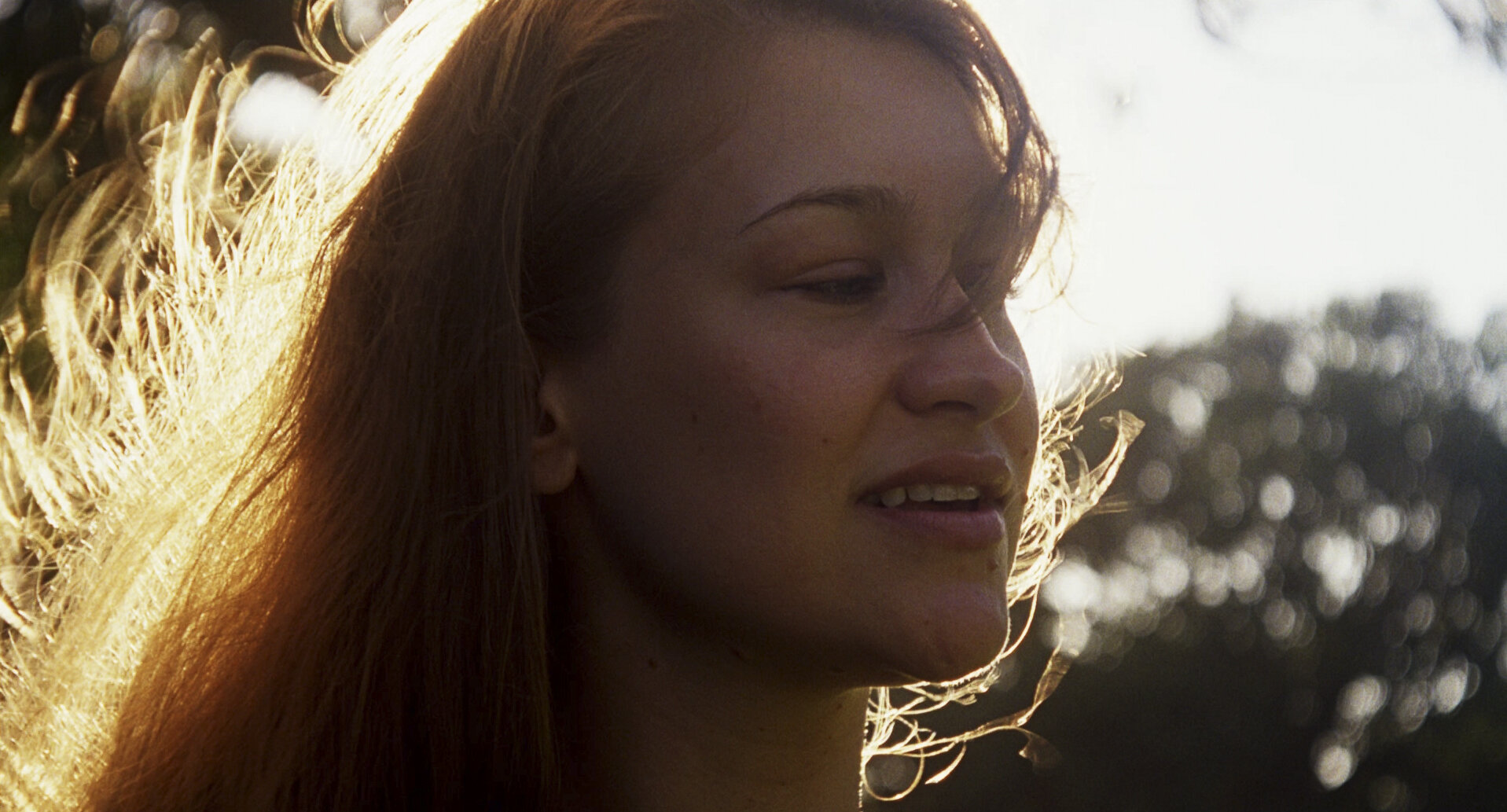
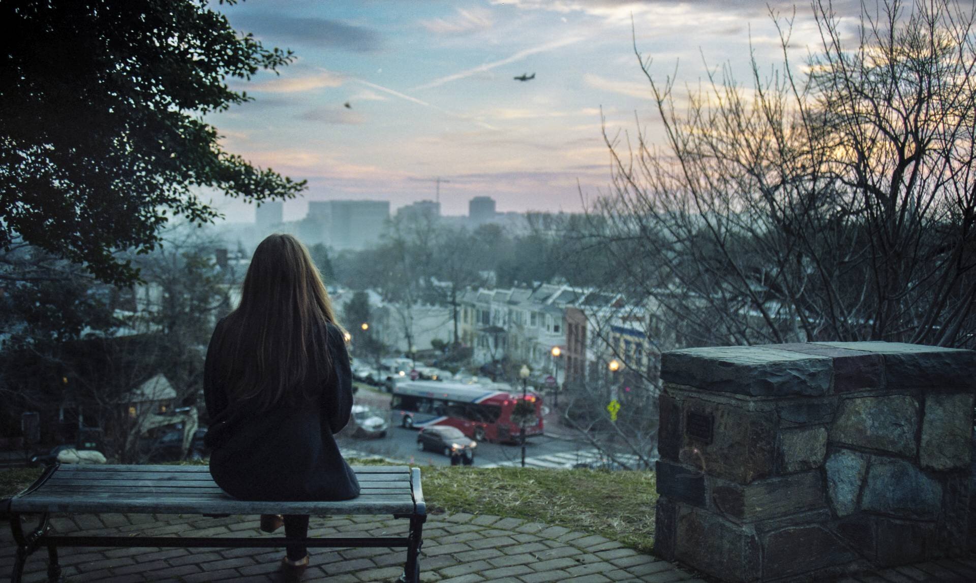
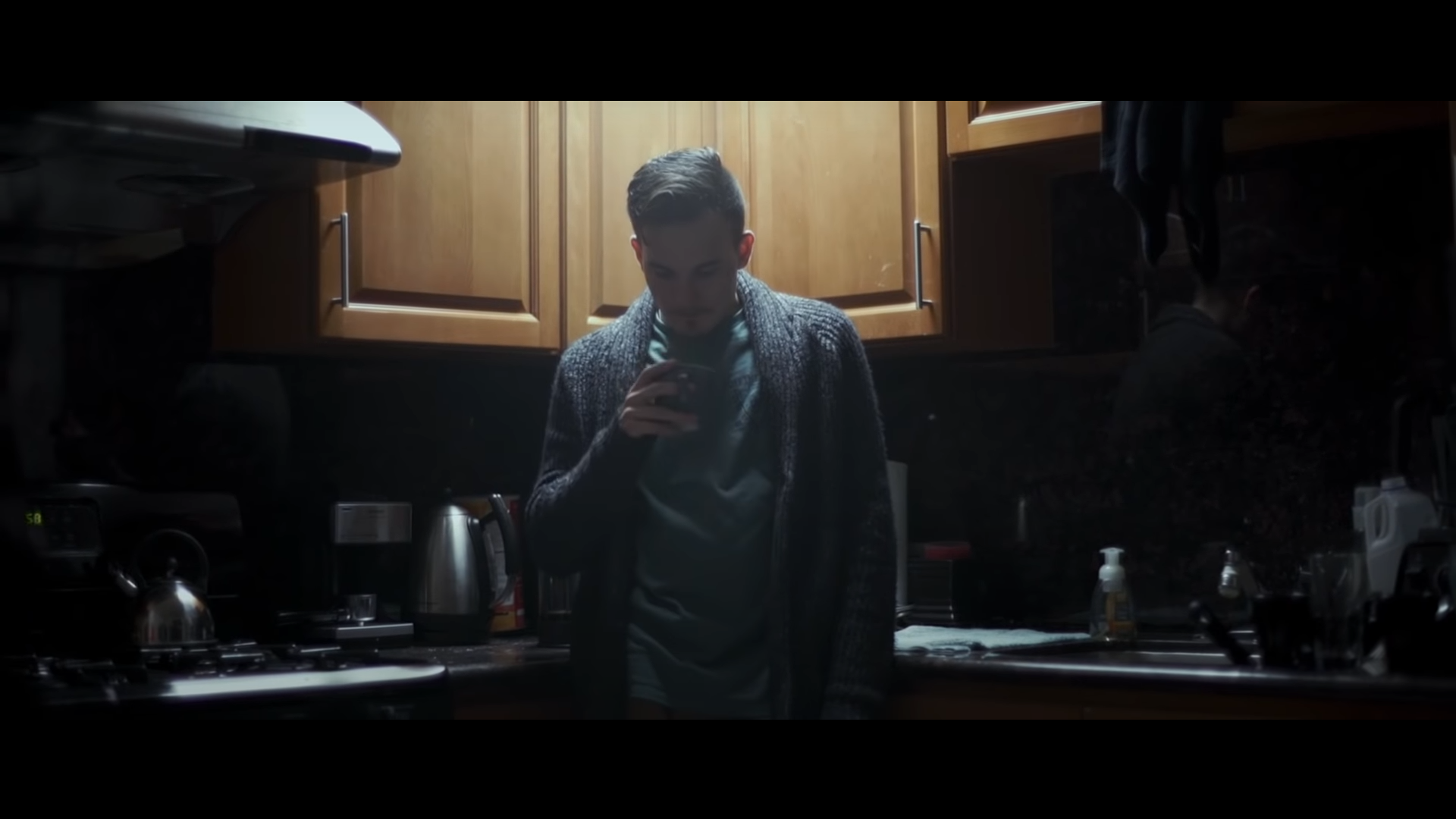
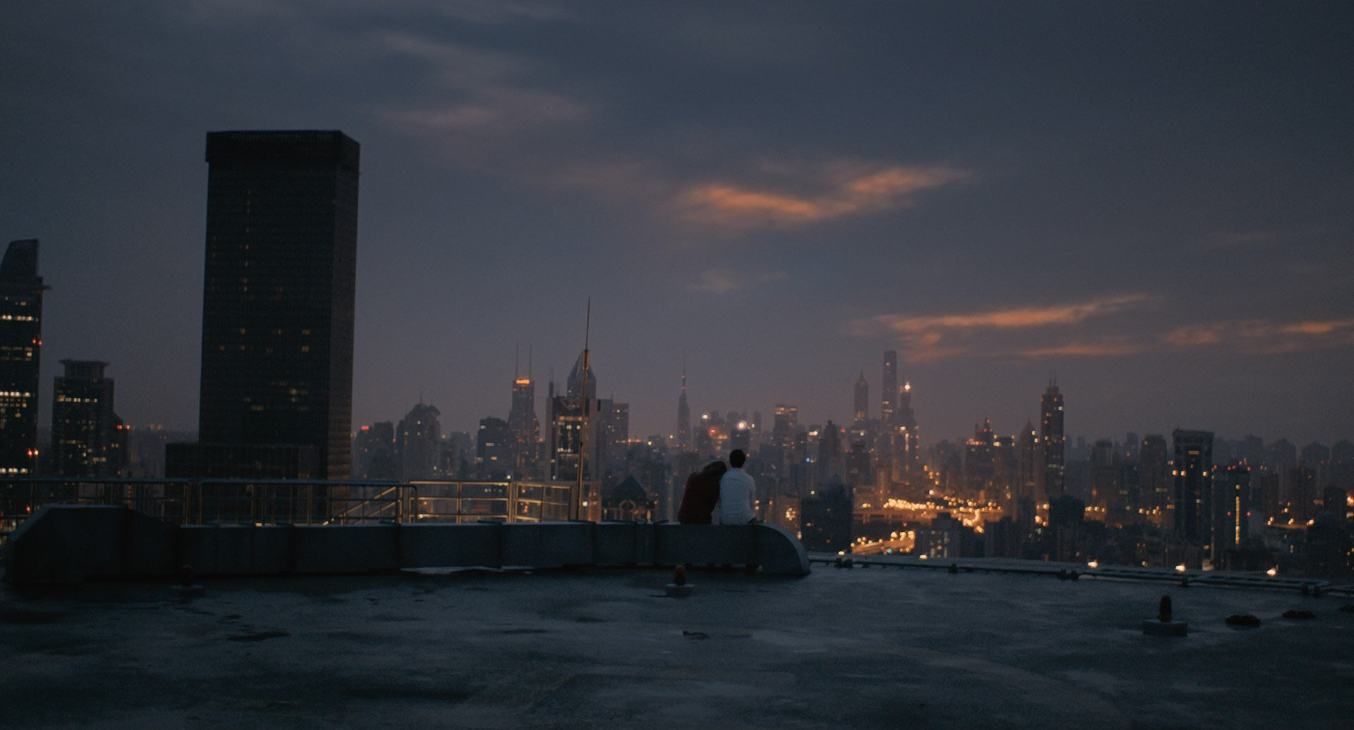
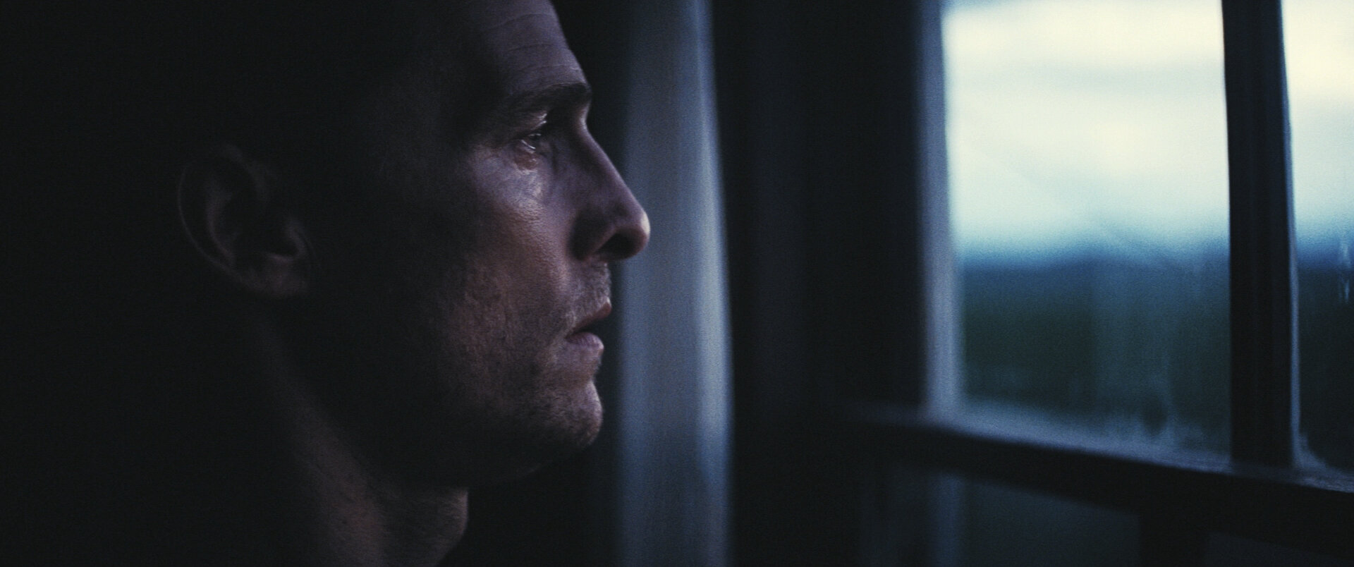
There is almost zero consistency in color or anything else across these images, but they all strike a tone that at one point or another I’d like to hit for the film.
While building the color grade is important, this part will be skipped until I have some footage from Ava to grade.
To Be Continued.
The next part of this series will deal with lenses.